Cerera Ceramics 2024

Cerera Ceramics
Visual identity
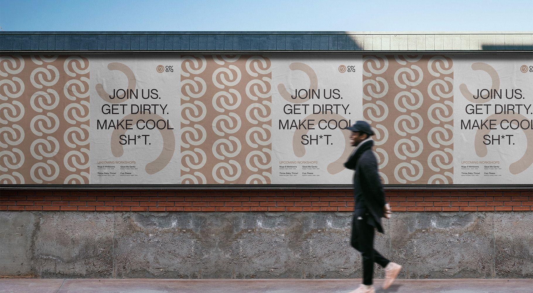
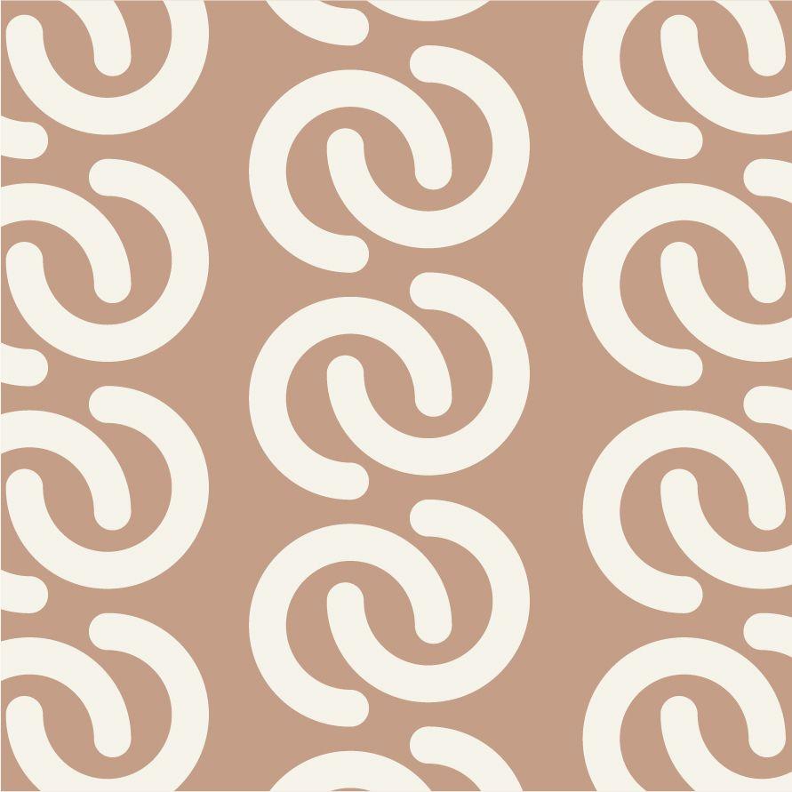
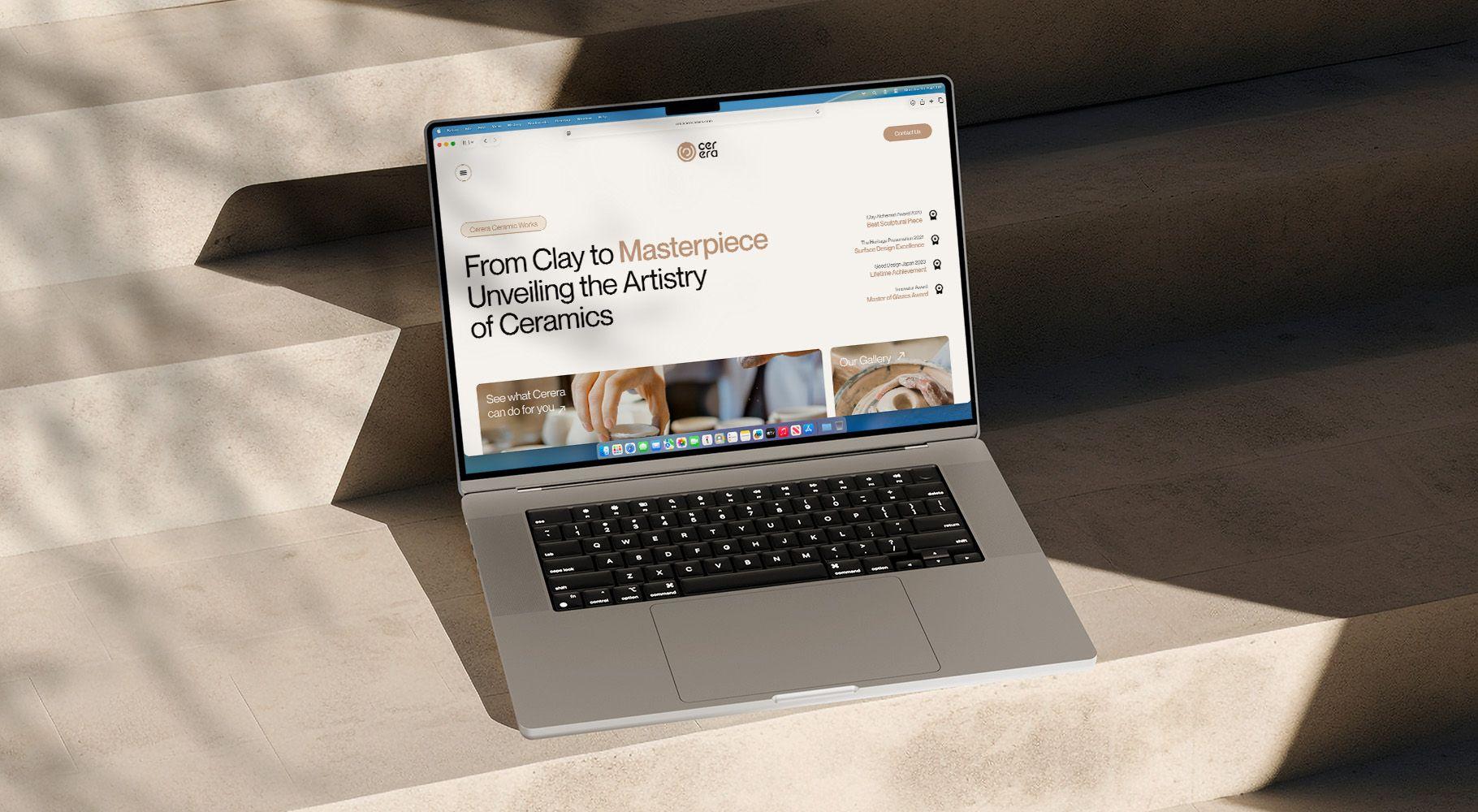
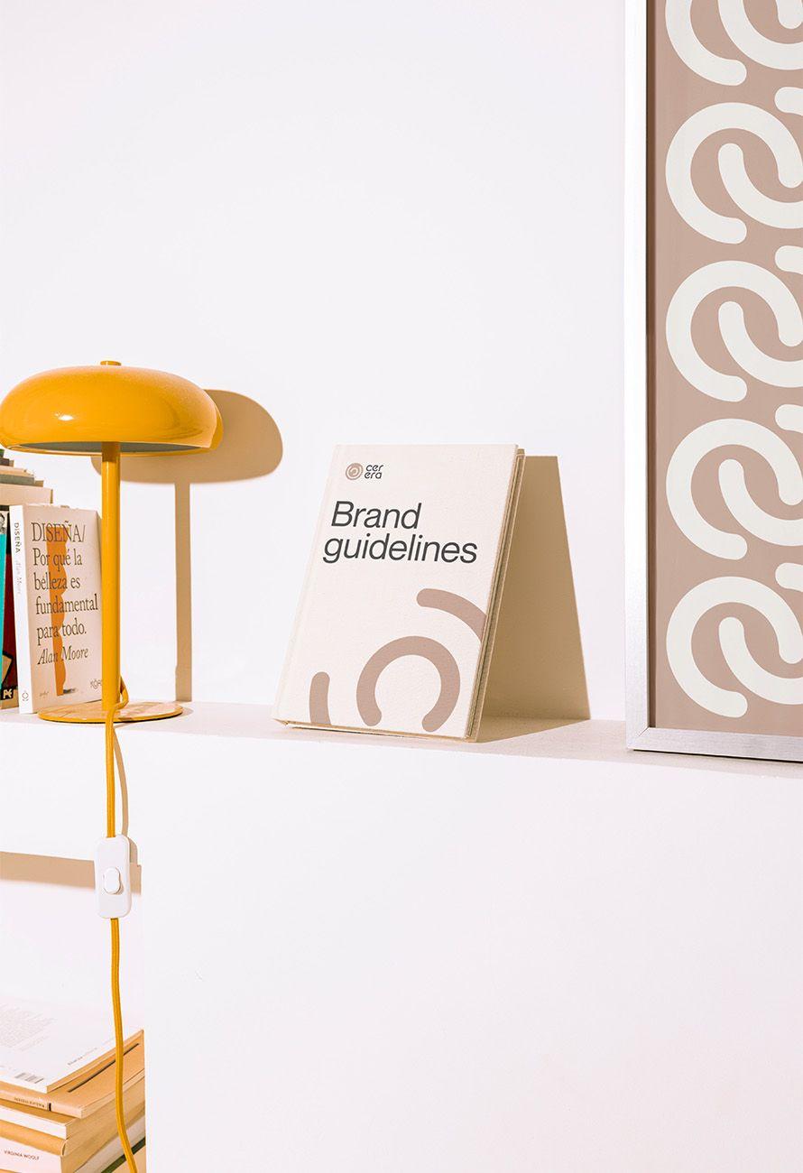
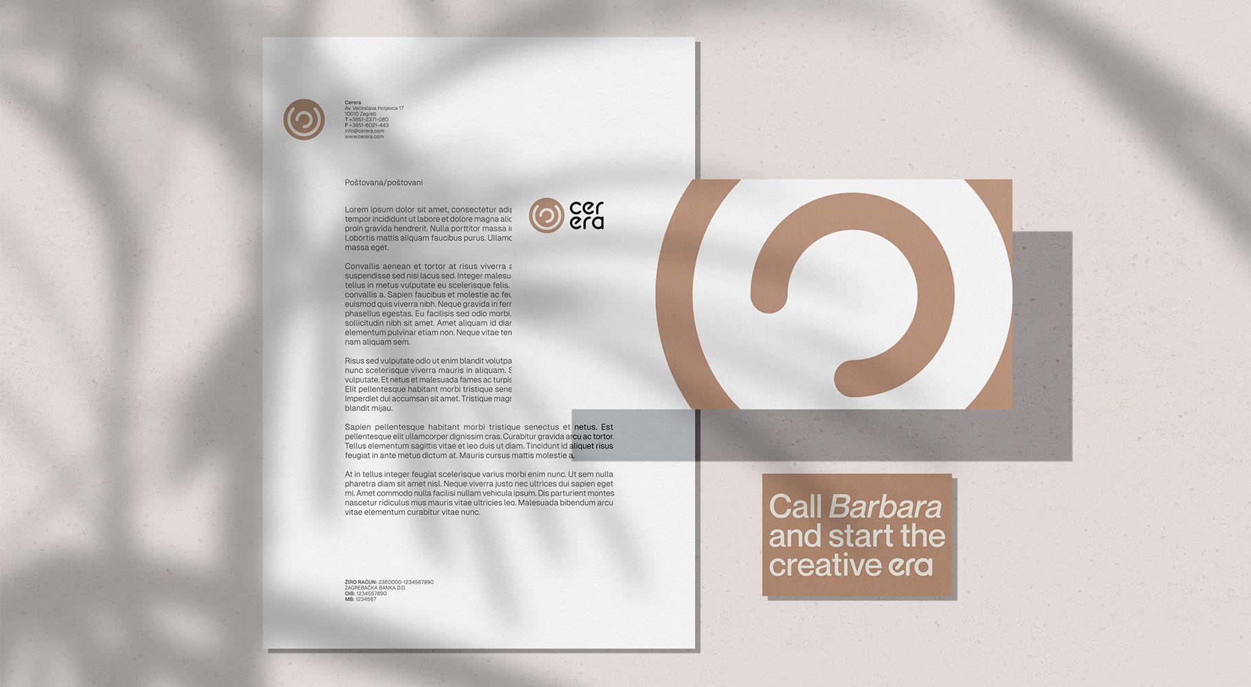
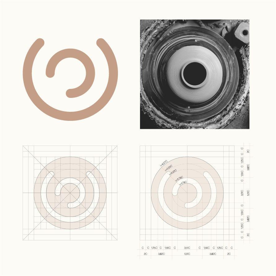
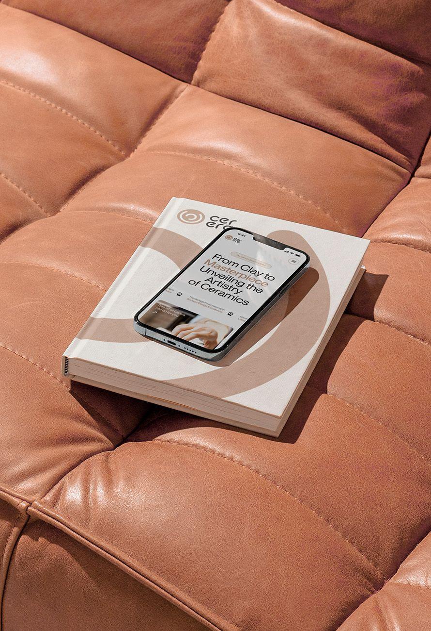
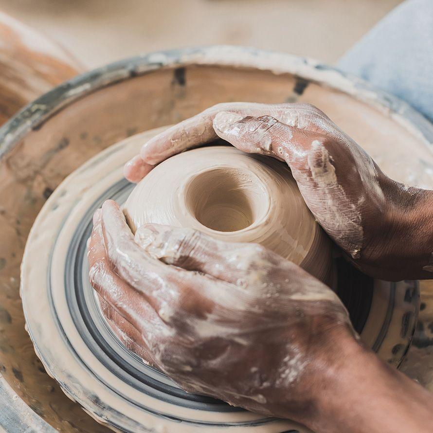
Cerera is a ceramics school created as a space for creativity, self-expression, and moments of calm through hands-on making. The project focused on developing a visual identity that reflects both the tactile nature of ceramics and the personal experience behind the craft. The logo was created by combining two letterforms C into a symbol that resembles a vase viewed from above on a potter’s wheel. Beyond its connection to ceramics, the form also evokes a stylised fingerprint, reinforcing ideas of individuality and the unique creative journey of each participant. Through repetition, asymmetry, and a restrained visual language, the identity creates a distinctive system that communicates creativity, craftsmanship, and personal expression across a variety of applications. Cerera is a fictitious brand, made up for the needs of a semester project.

Zagreb Design Week
The project was selected as a finalist in the Student Visual Identity category at Zagreb Design Week, recognising the strength of its concept, visual system, and thoughtful approach to brand communication.

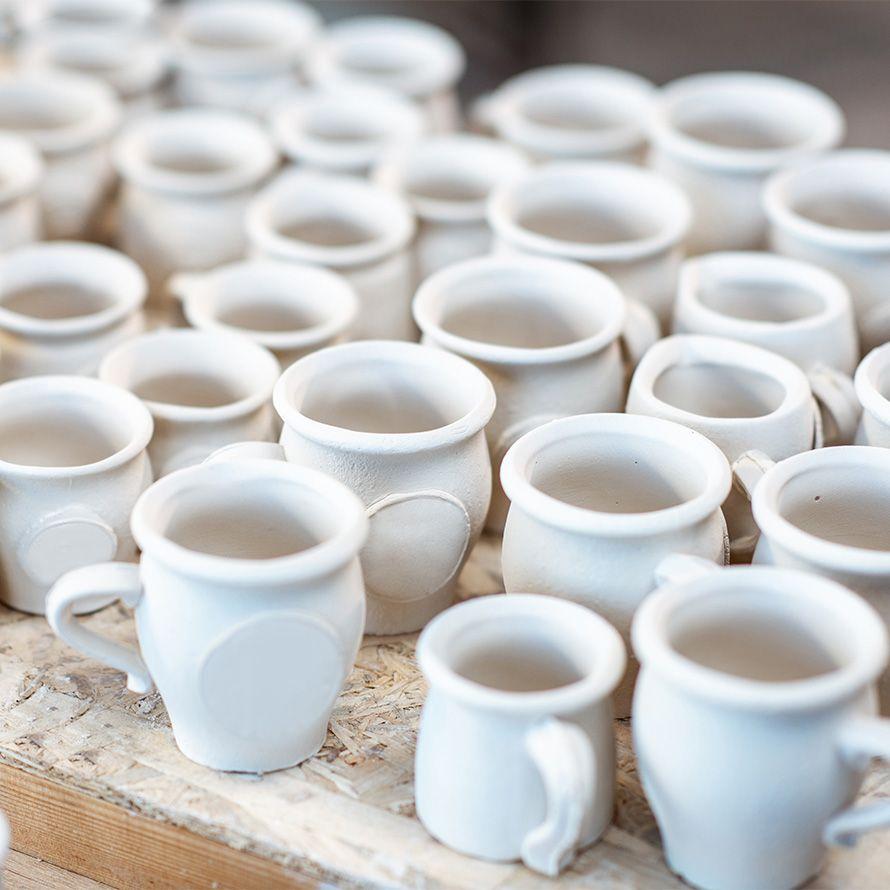
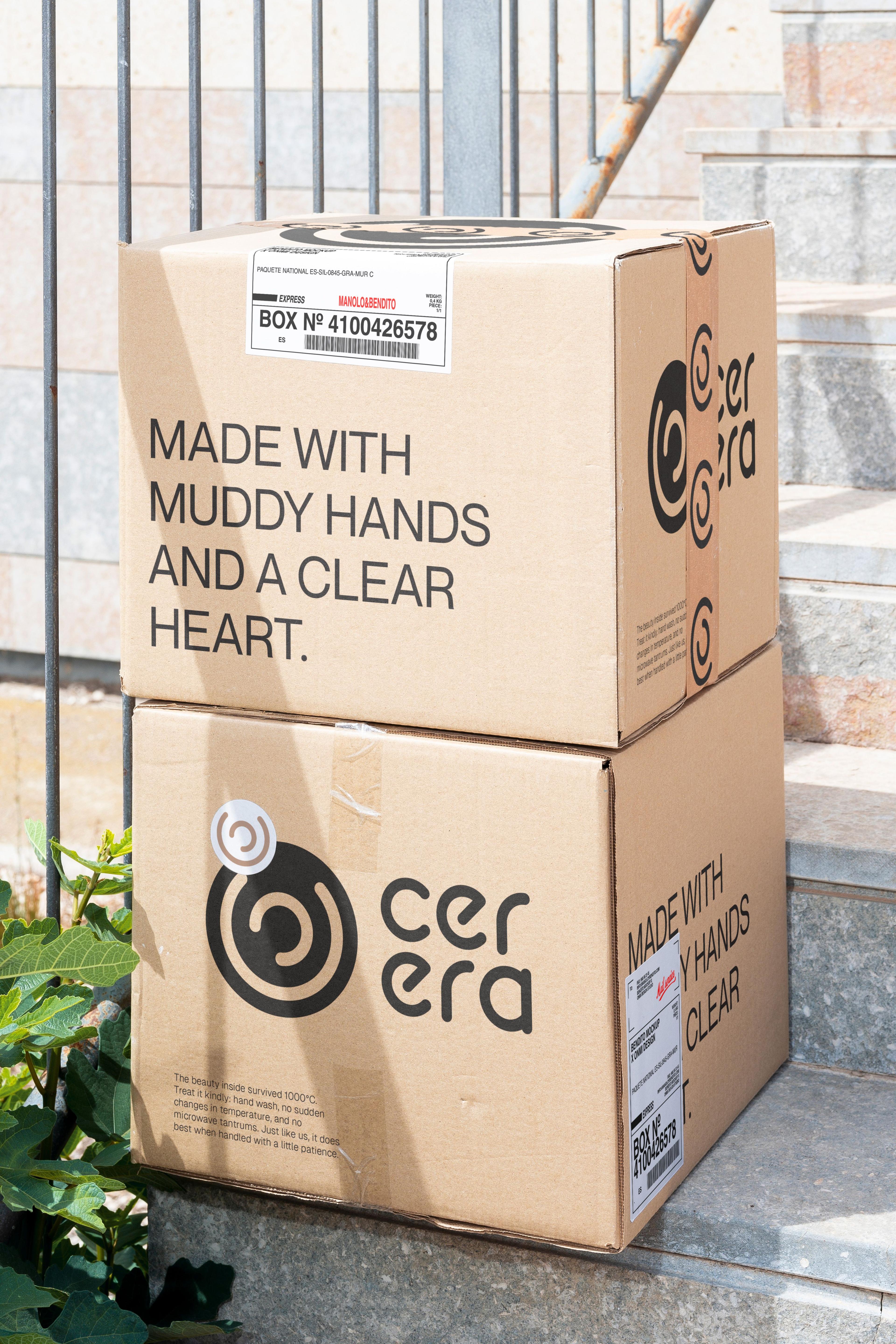
The name Cerera draws inspiration from Ceres, the Roman goddess of agriculture and harvest. Sharing the same linguistic root as ceramics, the name evokes associations with earth, craftsmanship, tradition, and creation.