Studio Tišina 2026

Studio Tišina
Visual identity
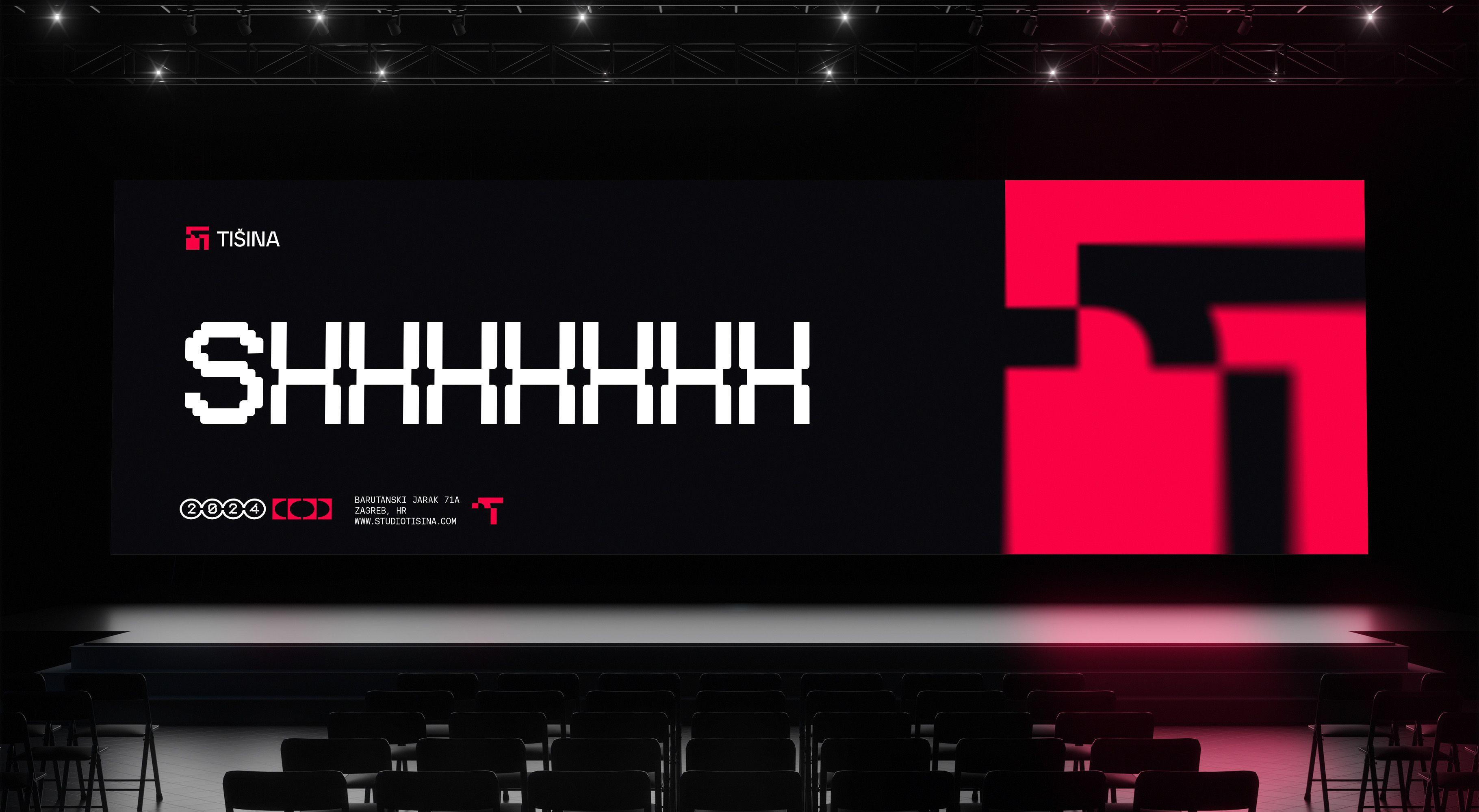
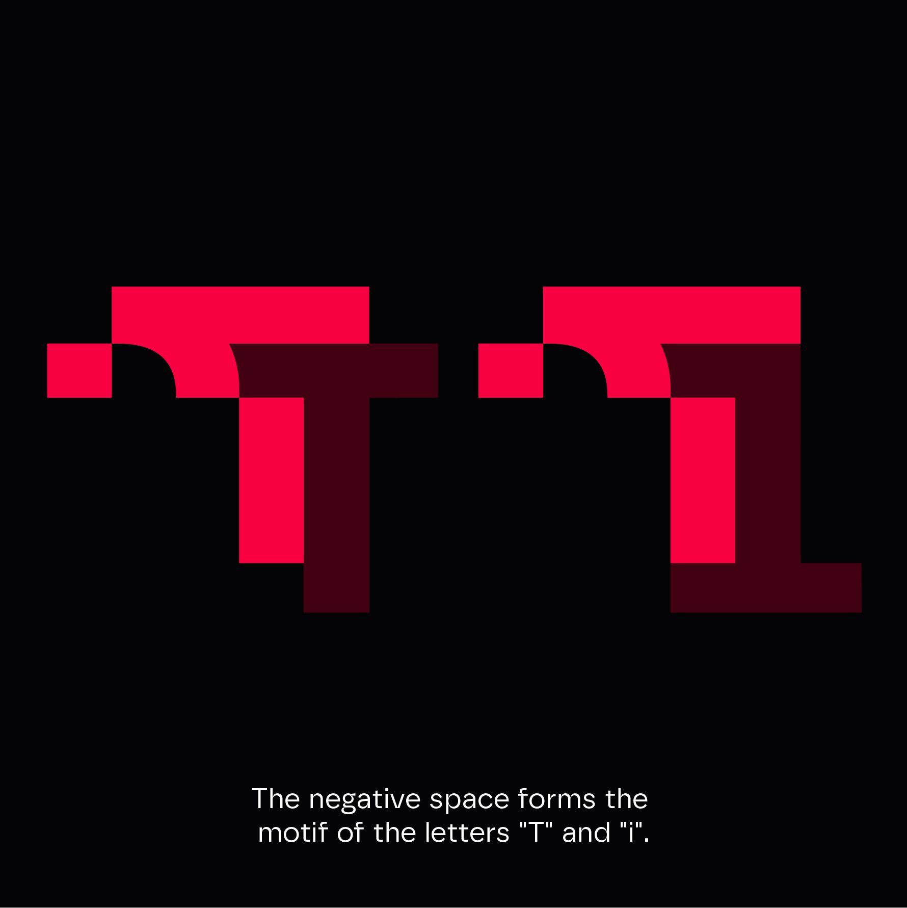
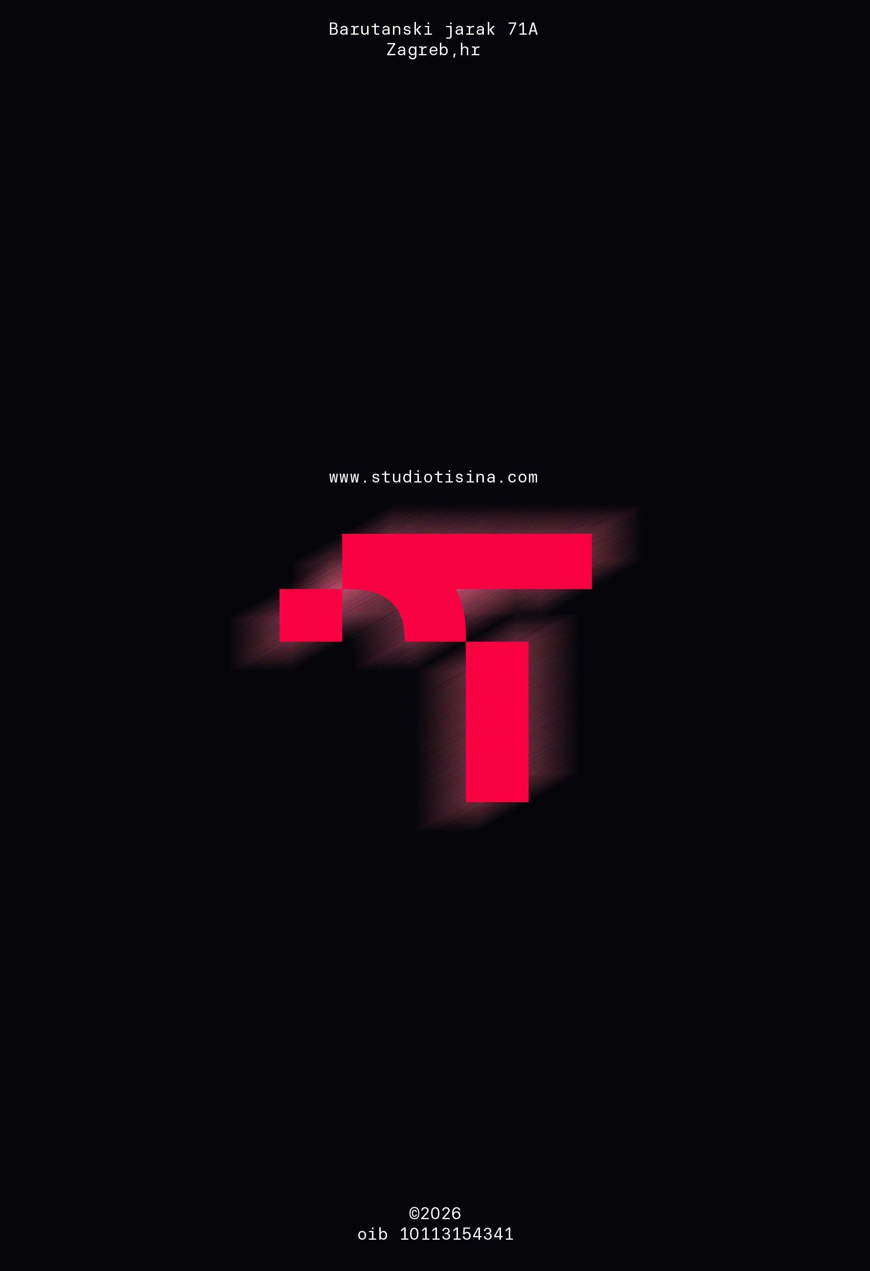
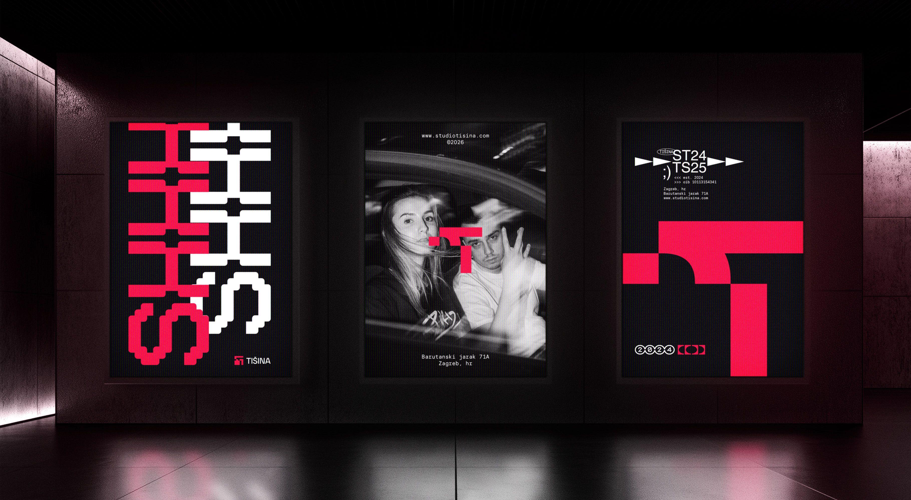
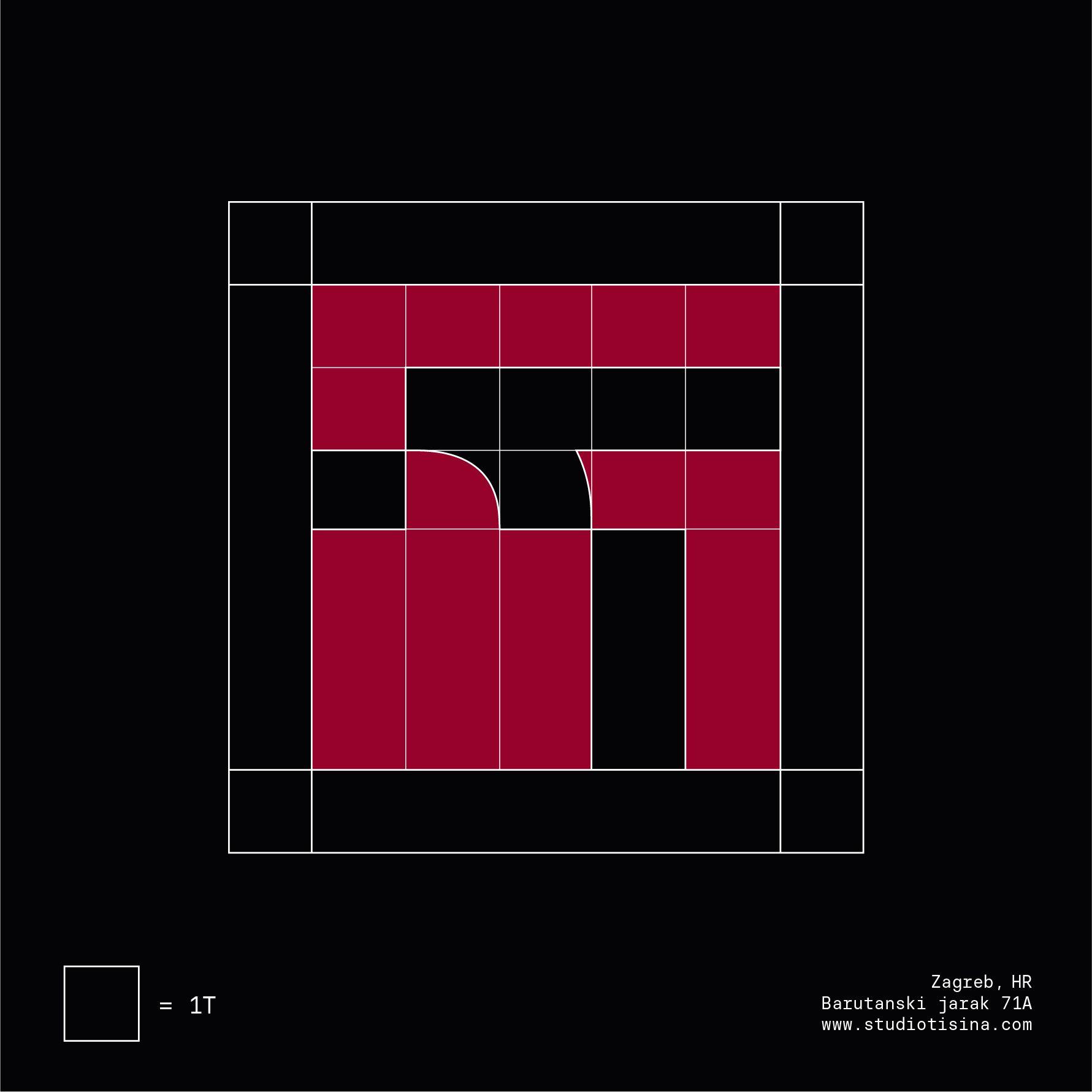
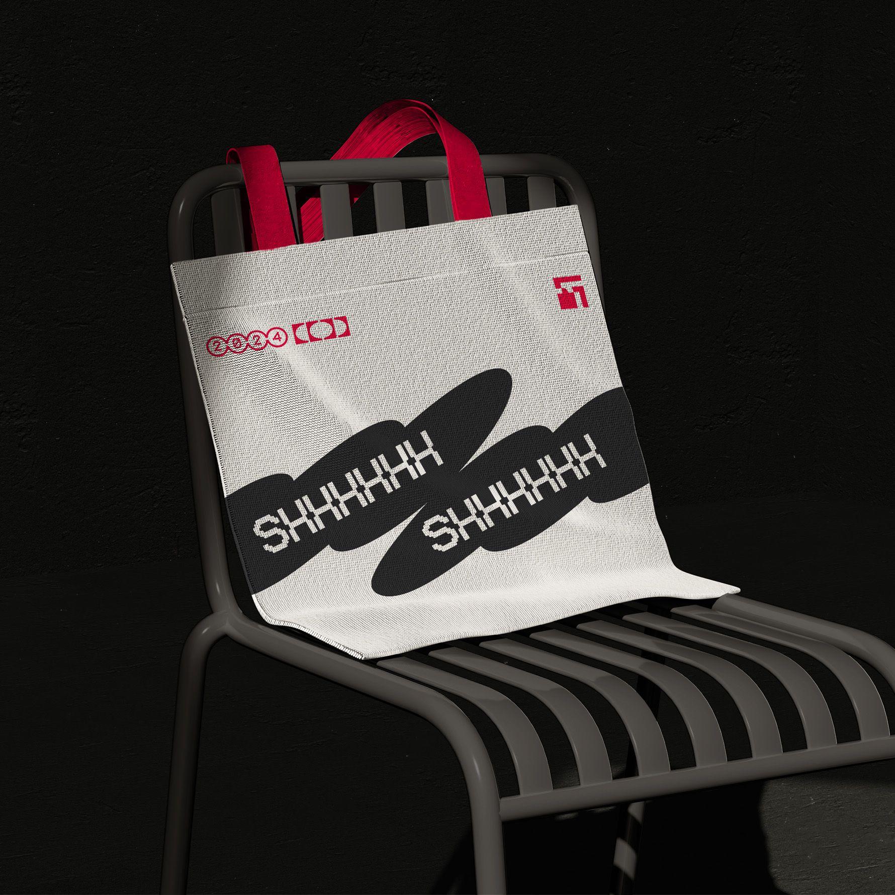
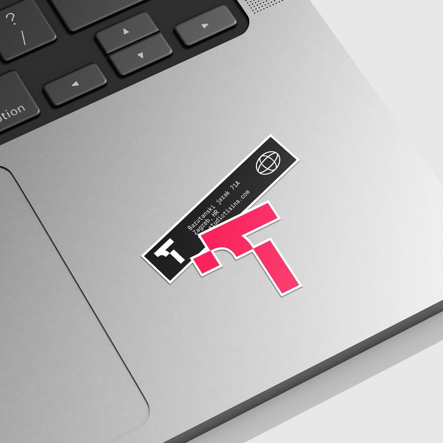
Studio Tišina is a visual identity developed for a digital studio shaped by the contrast between the quiet of the night and the constant noise of the city. The identity translates this idea into a visual language built around contrast, movement, light and a certain sense of ambiguity. Sharp forms and controlled compositions create tension without making the system feel aggressive, while abstract details leave room for interpretation. The logo works as a compact expression of this approach, balancing clarity with an irregular, almost elusive character. The identity was developed as a flexible system for digital use, allowing the same visual principles to move across the studio’s website and other communication without losing its distinct atmosphere. The system stays restrained, giving the identity presence without visual excess.
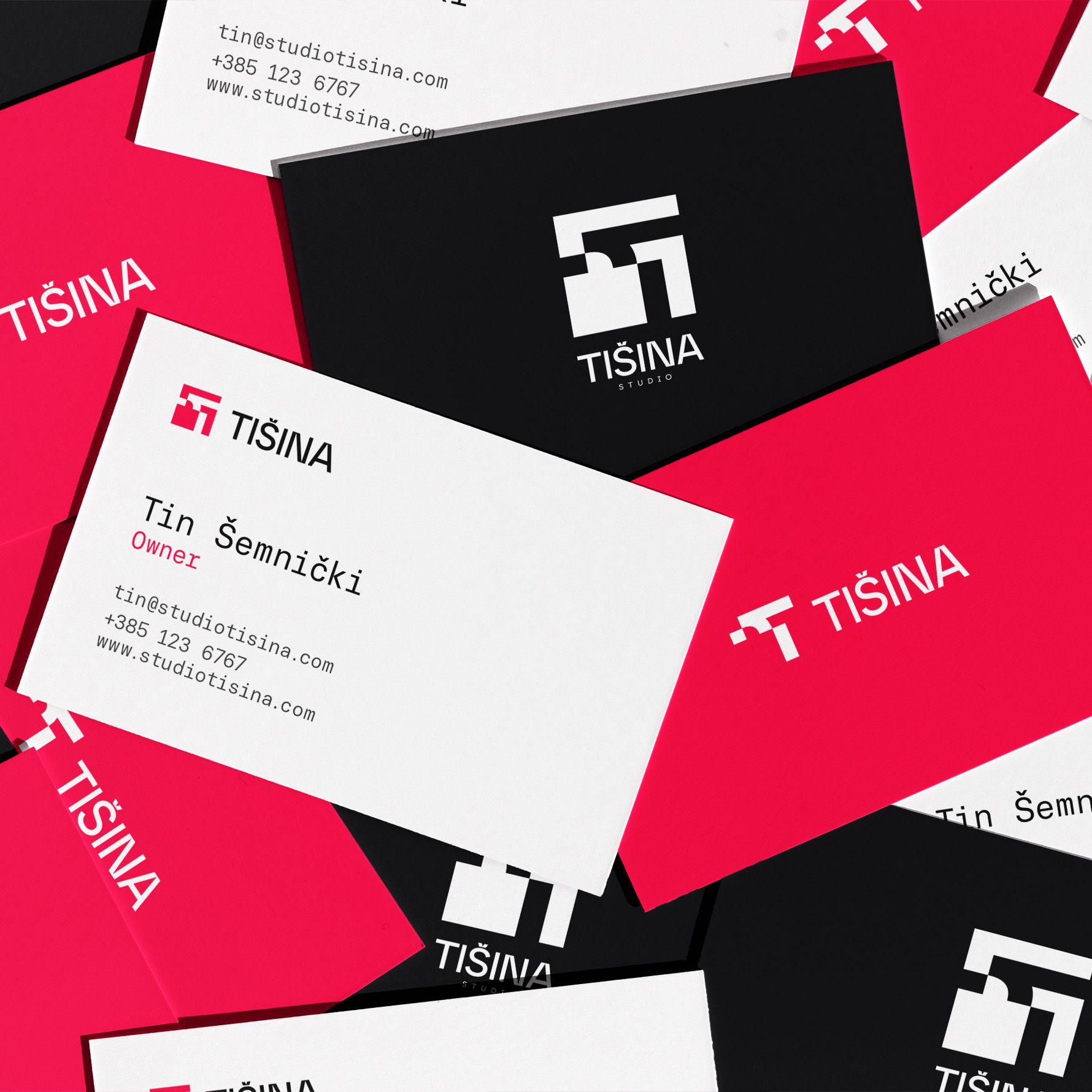
The name
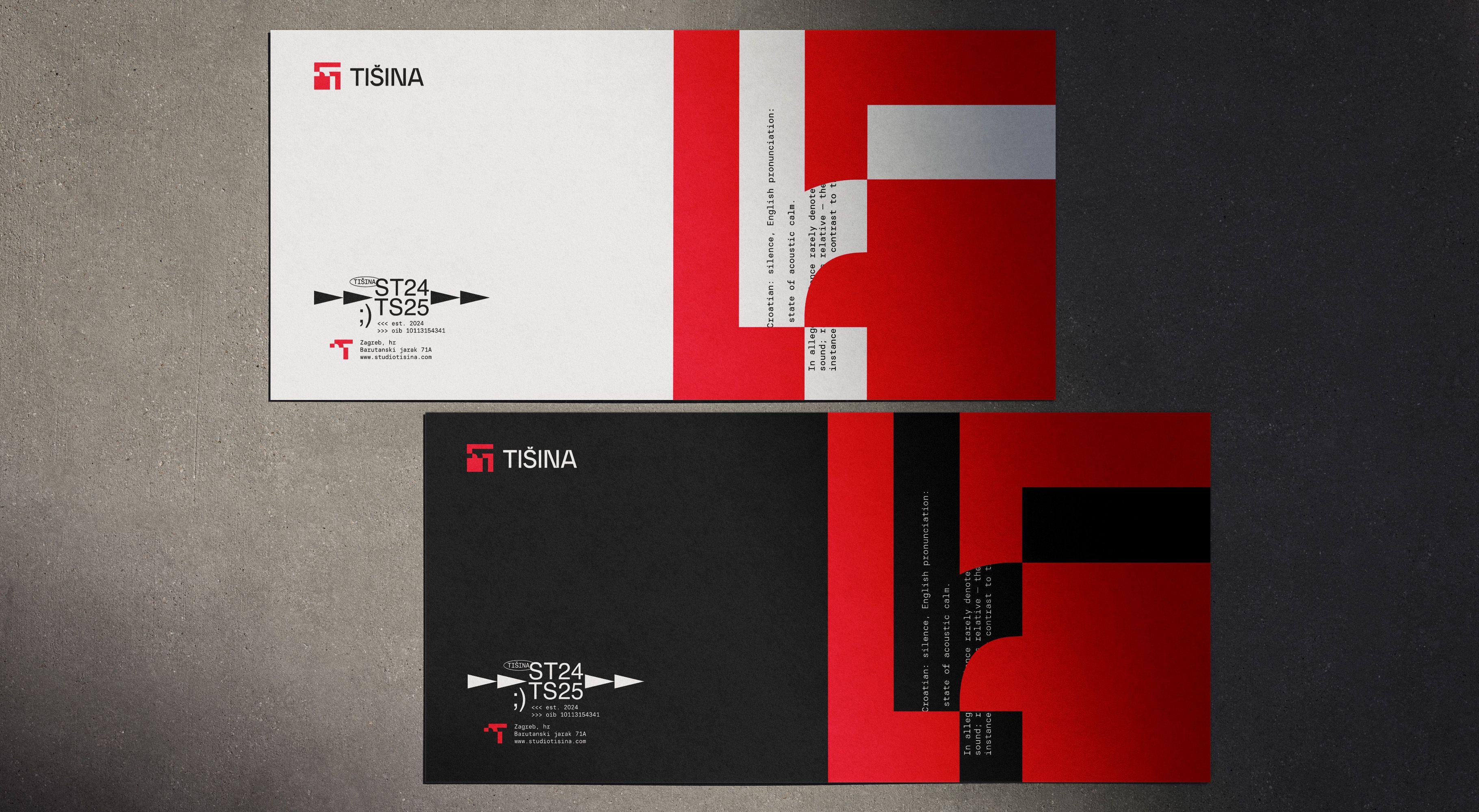
The name TIŠINA refers to a relative state of calm rather than a complete absence of sound. Set against the noise of the metropolis, it defines the studio through contrast and quiet tension.
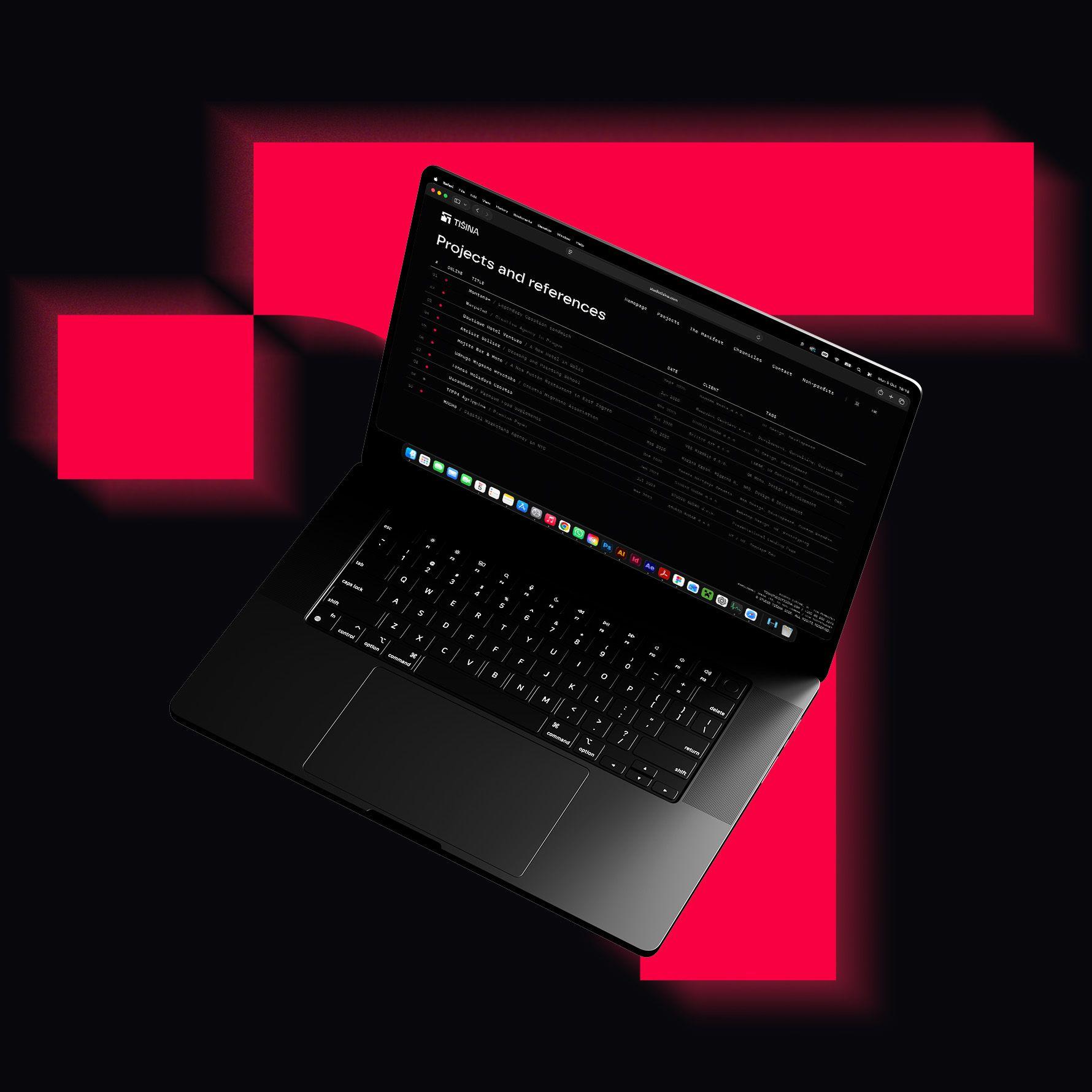
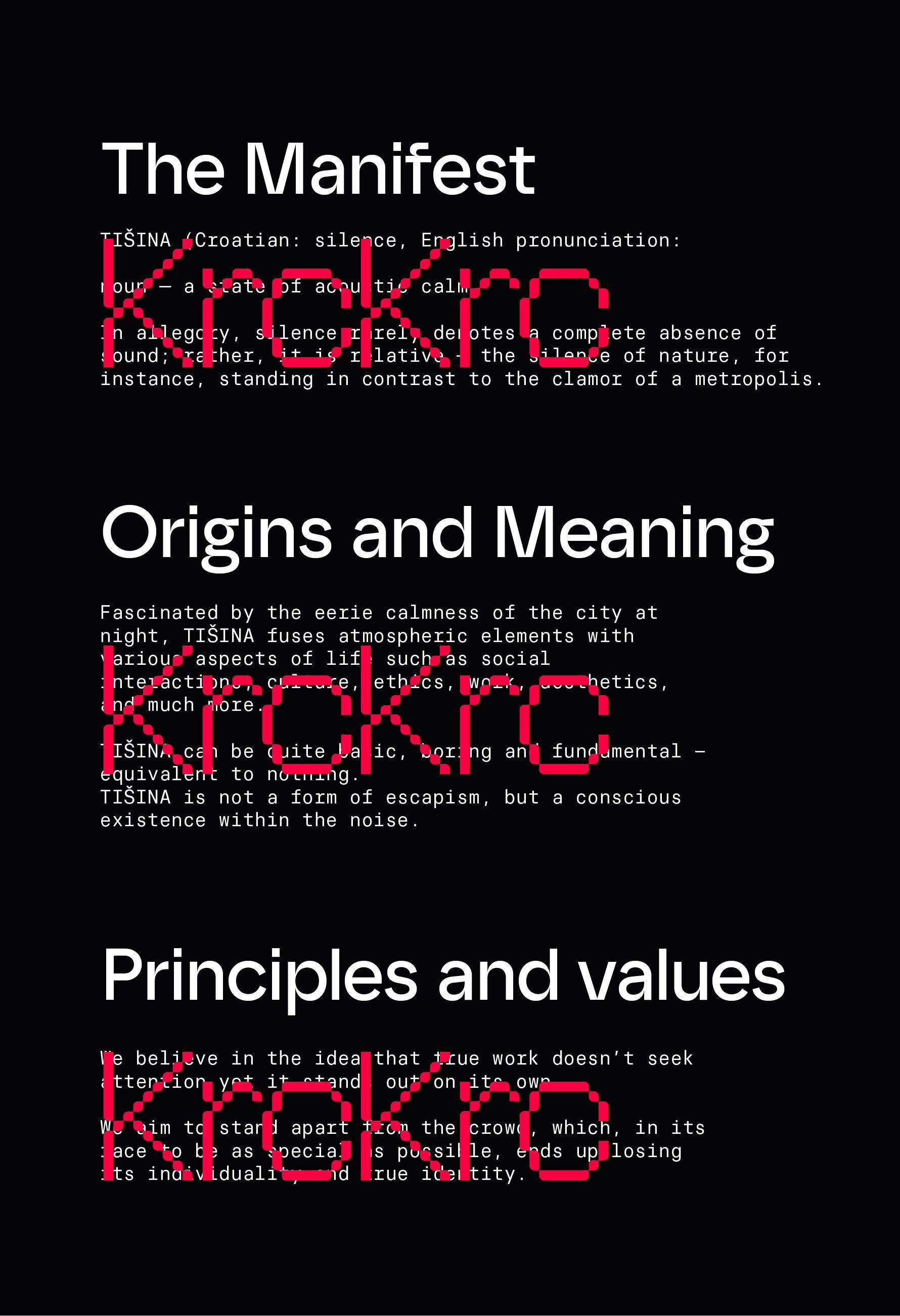
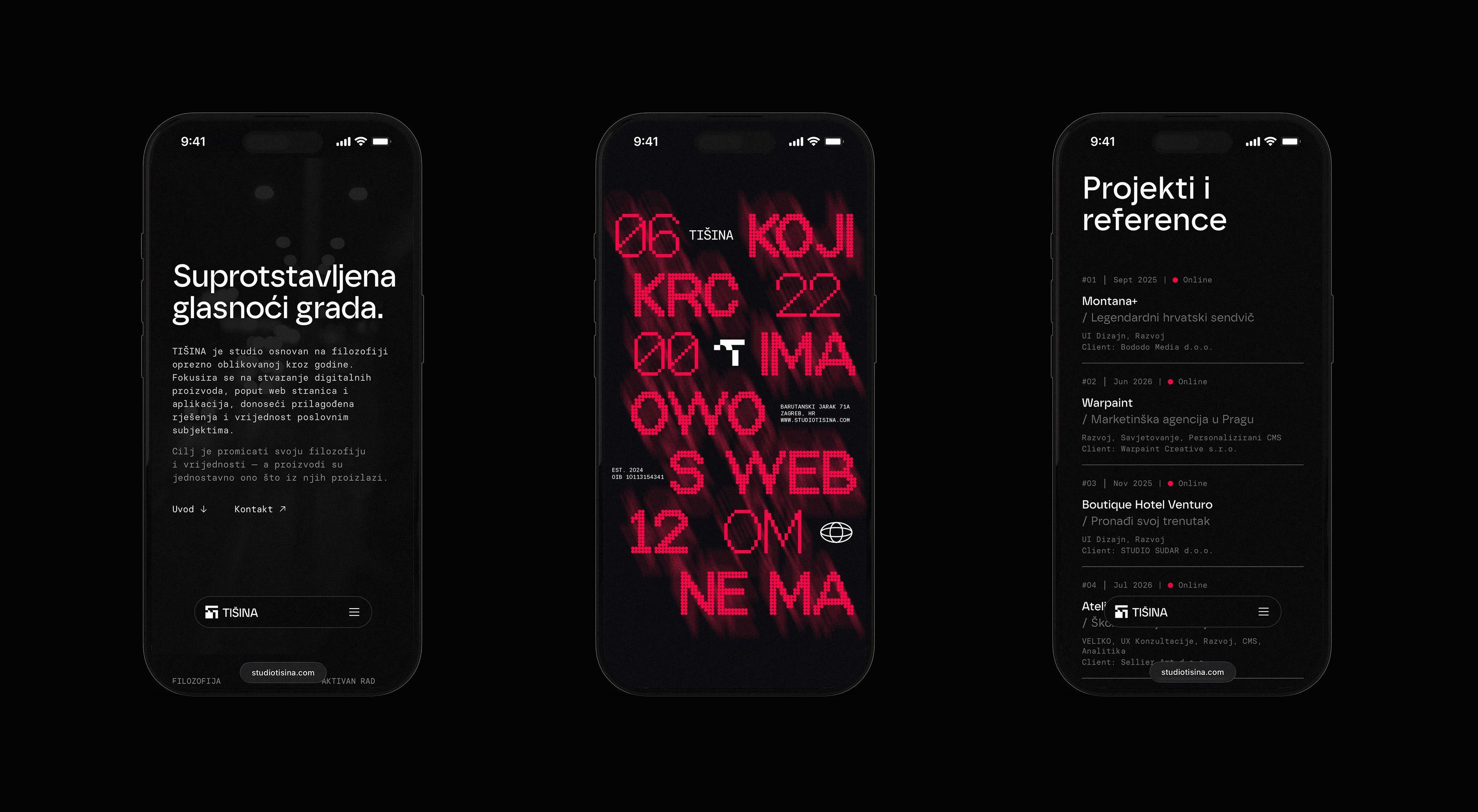
Alongside the visual identity, a website was developed for the studio, extending the same principles of contrast, sharpness and restrained movement into a digital environment designed around its work and philosophy.